
One of the CRO tasks you get to do often is landing page analysis. Be it for the new clients that want an audit or an established one that plans a redesign or launches a new funnel, it falls onto the CRO team’s plate to go through the pages, analyze the content, the potential issues and friction points and provide guidance and suggestions on how to address those.
I’ve attended a landing page optimization webinar by Michael Aagaard a while ago. I highly recommend watching the recording if you intend to make use of Google Analytics in any way – it’s simple enough to be understood with basic web knowledge but the amount of value you can extract from the examples is great. Also, Michael’s delivery is fun and easy-going, so you have no reasons not to watch it :)
After the webinar I thought to myself: “This is pretty routine and applicable to most websites with a semi-decent GA setup. How could this be automated?”
So I gave it a go and in this article I’m going to try and show you how some of the routine data extraction and analysis can be automated. I’m going to use Google Analytics API (obviously) and R for this, but you could use any programming language to do the data wrangling.
Setting up
Like I said, I’m going to do the scripting in R, so to reproduce, you’ll need to have R downloaded and installed, as well as the RStudio installation and some packages that I’ll mention below.
To pull data from Google Analytics API, you’ll have to enable API for your account and have the GA access to the website shared to that same account.
Make sure to do this before proceeding.
One of the first things I look at when doing CRO analytics is looking at the overall picture. You have to go from strategic layer to the little details step-by-step, so it’s best to start looking at the data in general and then segment from there.
We’ll start by installing a bunch of R packages that make the data pulling and wrangling a breeze.
install.packages(
  c(
    "googleAnalyticsR", # our interface with GA
    "tidyverse",        # a must have for R scripting
    "stringr",          # handy string functions
    "lubridate",        # handy date and time functions
    "ggthemes",         # pretty plot themes
    "ggrepel",          # non-obstructive plot labels
    "scales"            # custom plot scales
  ),
  dependencies = T      # install dependencies
)
This should set you up with all you need for the data pulling, transforming and visualizing, and then a bonus to make it pop.
Authorizing
To receive Google Analytics data in R, you need to authorize API access first. This is a one-time action done with a single function call:
ga_auth() # authorize the current R session
Once executed, you should get an authorization request appear in your browser. Approve it, copy the string on the next page and paste it into the console window in RStudio. This should allow you to pull data from any GA view that your authorized account has a view access to.
If you wish to change the account to a different one, re-run the function with new_user = TRUE parameter.
ga_auth(new_user = TRUE) # force new aurization, even if there is a cached token
Pulling your first data from Google Analytics
Now, you’re ready to make your first request. Despite the fact that you need to pass several parameters to the function, it’s pretty straightforward. Let’s pull the number of sessions for the past 30 days:
sessions = google_analytics(
  viewId = 1234567,	# replace this with your view ID
  date_range = c(
    today() - 30, 	# start date
    today()		# end date
  ),
  metrics = "sessions"
)
When executed, the above should result in a sessions data frame that contains a single value – the count of sessions for the view you’ve picked for the past 30 days, including today.
Now let’s put together something more meaningful, shall we?
Session share vs sales share vs revenue share
A good way to assess the traffic on the website is to see how do the major traffic sources stack up against each other in terms of sessions, sales and revenue. So let’s do just that.
Let's add a couple of things to the code that we've already written:
sources_raw = google_analytics(
  viewId = 1234567,     # replace this with your view ID
  date_range = c(
    today() - 30, 	# start date
    today()		# end date
  ),
  metrics = c(
    "sessions",
    "users",
    "transactions",
    "transactionRevenue"
  ),
  dimensions = c(
    "channelGrouping"   # pull the default channel grouping as the only dimension
  ),
  anti_sample = TRUE    # if you happen to encounter sampling, add this parameter to pull data in multiple batches, automatically
)
Upon running, you should see something like this in the console:
2018-10-03 09:47:01> anti_sample set to TRUE. Mitigating sampling via multiple API calls.
2018-10-03 09:47:01> Finding how much sampling in data request...
Auto-refreshing stale OAuth token.
2018-10-03 09:47:11> Downloaded [9] rows from a total of [9].
2018-10-03 09:47:11> No sampling found, returning call
2018-10-03 09:47:17> Downloaded [9] rows from a total of [9].
And the newly created sources_raw data frame should contain the data for your website's top sources, sales and revenue:
    channelGrouping sessions  users transactions
1           (Other)      134    123            1
2            Direct    38556  32369          318
3           Display      383    234            8
4             Email       52     33            0
5    Organic Search   177168 147180         1349
6 Other Advertising     9531   7531          139
7       Paid Search    37256  30232          469
8          Referral    87839  65205         1088
9            Social     6687   5459           58
Congratulations, you've just pulled your first meaningful GA report through R! Now, if you've ever created any custom reports or used the GA Query Explorer you probably think "Yeah, but I can do this in the web interface, too..." – and you're right.
The report we've just pulled is very primitive, and can be constructed in the GA custom report or in the query explorer in no time. The devil's in the details, though – while web-based tools I mentioned do allow to pull the data, they fall short when it comes to altering, visualizing it or automating such reports. So let's go ahead and improve the data so it's slightly more understandable.
Note: this is where R syntax may get weird for the newbies. The R 'pipe' operator you're about to use is very convenient, but it might take a while to get used to all the %>% pieces in the code, especially if you've never dealt with pipes in other programming languages.
In a nutshell, these two lines of code do the same:
result = sum(numbers)
result = numbers %>% sum()
While it makes little difference using it for quick and short operations, it certainly helps when you want to chain a series of operations:
# instead of nesting the operations you chain them one after another
results = mean(rbind(numbers_old, numbers_new))

results = numbers_old %>%
  rbind(numbers_new) %>%
  mean()
Here's a couple of articles that help make sense of it:
- 'Pipes in R tutorial for beginners' by Karlijn Willems on DataCamp
- 'dplyr and pipes: the basics' by Sean C. Anderson
Cleaning up
# now let's make some calculations on the sessions/users share and conversion rates
sources_clean = sources_raw %>%
  mutate(
    session_share = sessions / sum(sessions),
    sales_share = transactions / sum(transactions),
    revenue_share = transactionRevenue / sum(transactionRevenue)
  ) %>%
  arrange(-session_share) %>%
  transmute(
    channel = channelGrouping,
    sessions,
    users,
    sales = transactions,
    revenue = transactionRevenue,
    session_share,
    session_addup = cumsum(session_share),
    sales_share,
    sales_addup = cumsum(sales_share),
    revenue_share,
    revenue_addup = cumsum(revenue_share),
    cr_sessions = transactions / sessions,
    cr_users = transactions / users,
    rps = revenue / sessions,
    rpu = revenue / users
  )
That's more like it. Now your sources_clean data frame contains something similar to this:
            channel sessions  users sales revenue session_share session_addup  sales_share sales_addup revenue_share revenue_addup cr_sessions    cr_users      rps      rpu
1    Organic Search   177266 147260  1349 4031569  0.4953888976     0.4953889 0.3930652681   0.3930653  0.4564352648     0.4564353 0.007610032 0.009160668 22.74305 27.37722
2          Referral    87904  65245  1089 2520890  0.2456571799     0.7410461 0.3173076923   0.7103730  0.2854032995     0.7418386 0.012388515 0.016690934 28.67776 38.63729
3            Direct    38575  32381   319  823330  0.1078019853     0.8488481 0.0929487179   0.8033217  0.0932135470     0.8350521 0.008269605 0.009851456 21.34362 25.42633
4       Paid Search    37288  30258   469  970110  0.1042053254     0.9530534 0.1366550117   0.9399767  0.1098312877     0.9448834 0.012577773 0.015500033 26.01668 32.06127
5 Other Advertising     9531   7531   139  331560  0.0266354043     0.9796888 0.0405011655   0.9804779  0.0375376625     0.9824211 0.014583989 0.018457044 34.78754 44.02603
6            Social     6699   5469    58  131380  0.0187210758     0.9984099 0.0168997669   0.9973776  0.0148742252     0.9972953 0.008658009 0.010605229 19.61188 24.02267
7           Display      383    234     8   21290  0.0010703347     0.9994802 0.0023310023   0.9997086  0.0024103536     0.9997056 0.020887728 0.034188034 55.58747 90.98291
8           (Other)      134    123     1    2600  0.0003744774     0.9998547 0.0002913753   1.0000000  0.0002943598     1.0000000 0.007462687 0.008130081 19.40299 21.13821
9             Email       52     33     0       0  0.0001453196     1.0000000 0.0000000000   1.0000000  0.0000000000     1.0000000 0.000000000 0.000000000  0.00000  0.00000
As you can see, we have now a complete picture of traffic allocation, sales, conversion ratios and revenue (totals and per-user). Pretty damn cool, right? But even though it's tidy, the data is not exactly easy to comprehend at a glance, especially for someone who hasn't worked with spreadsheets as much.
Generating plots
Vanilla plots in R are a little underwhelming – visually and procedurally, but lucky for us, there's a bunch of packages that make our life easier when we want to visualize something. Here's when the second batch of packages that we've installed is going to come in handy.
To create a plot, we'll need to pass our sources_clean data frame into a ggplot function:
sources_clean %>%         # passing our data frame into the plot function
  ggplot(
    aes(                  # specifying which fields should we use for plotting
      x = session_share,
      y = sales_share,
      color = channel
    )
  ) +
  geom_point(alpha = 5/7) # specifying the type of the plot we want
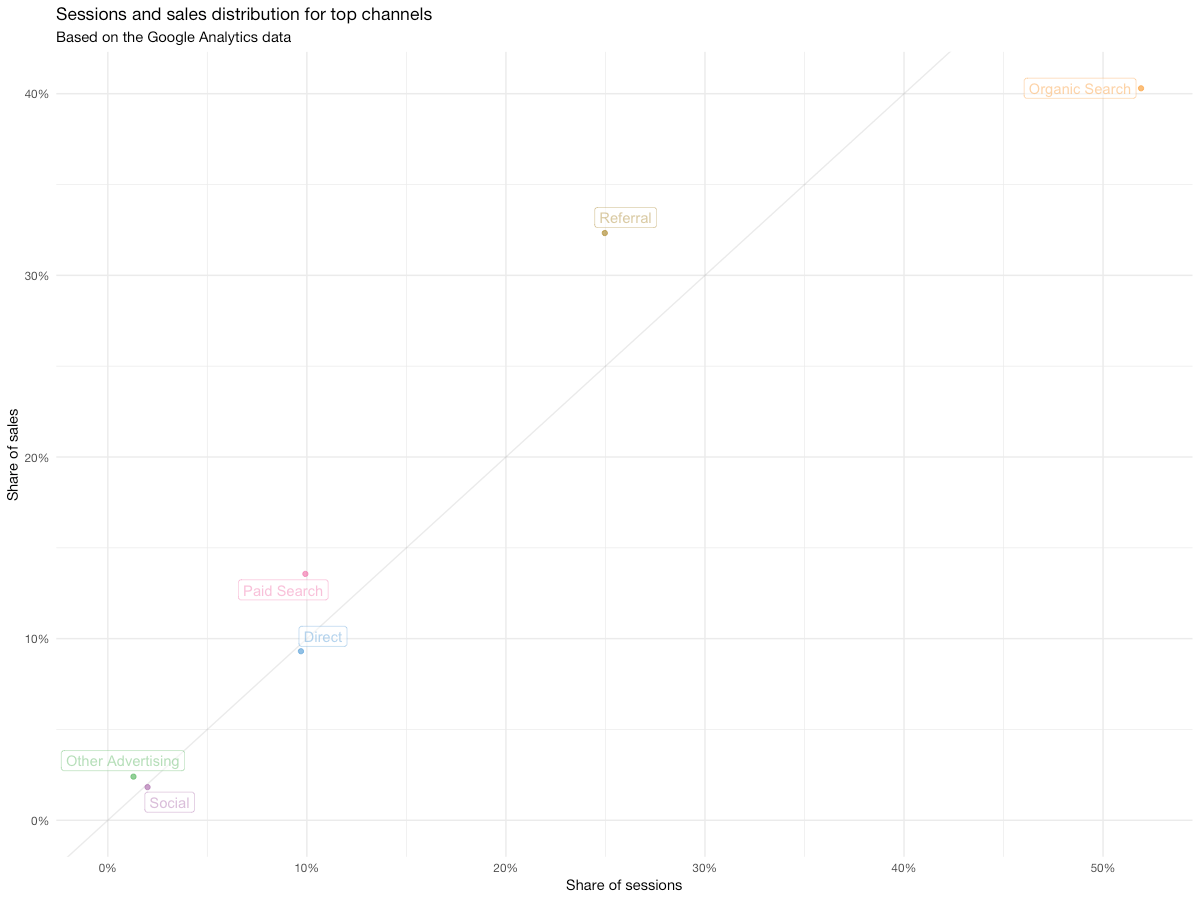
After running, you're likely seeing something like this:
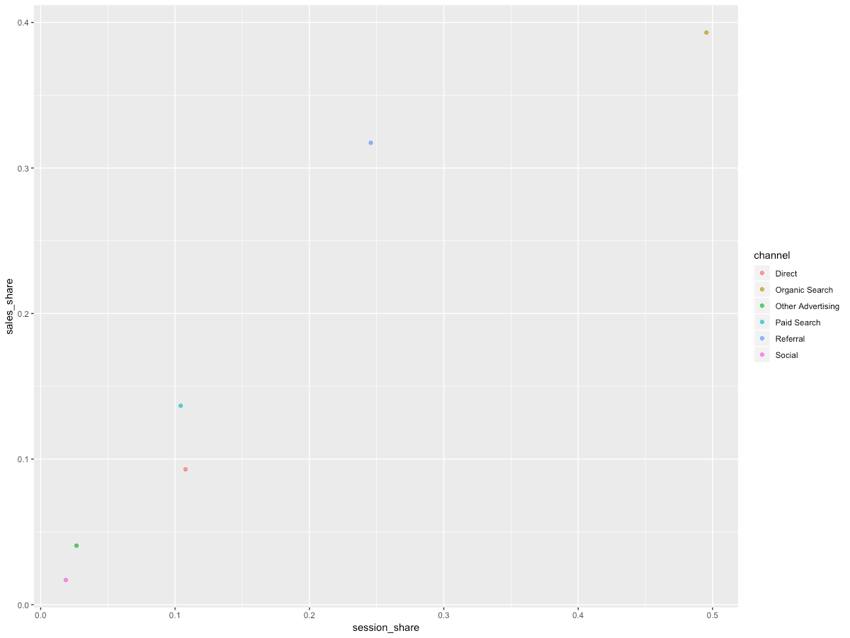
Still a little clunky, although you can already see the pattern. Let's make it into a more readable chart:
sources_clean %>%
  filter(sales >= 10) %>%   # show only the channels with 10+ sales
  ggplot(
    aes(
      x = session_share,
      y = sales_share,
      color = channel
    )
  ) +
  geom_abline(slope = 1, alpha = 1/10) +
  geom_point(alpha = 5/7) +
  theme_minimal(base_family = "Helvetica Neue") +
  theme(legend.position = "none") +
  scale_x_continuous(name = "Share of sessions", limits = c(0, NA), labels = percent) +
  scale_y_continuous(name = "Share of sales", limits = c(0, NA), labels = percent) +
  scale_color_few(name = "Channel") +
  scale_fill_few() +
  ggtitle(
    "Sessions and sales distribution for top channels",
    subtitle = "Based on the Google Analytics data"
  ) +
  geom_label_repel(alpha = 1/2, aes(label = channel), show.legend = F)
I'm not going to go over each of the cosmetics I've added – once you go over the ggplot cheatsheet and go through the official learning resources, you'll be able to do much more than we just did.
Here's what you have in the end:

Now we have something you can show to your client/leadership, or even put into a presentation. Even though the relationship between traffic and sales is mostly linear – which is good most of the time – we can see that organic traffic is slightly underperforming with 40% of sales generated by 50% of sessions. While not catastrophic – in fact, this is kind of expected with the sources that have such a big share of traffic – this might be symptomatic of issues with SEO, so we may want to investigate data on organic traffic in a little more detail later.
On the other hand, paid search and referrals seem to be working better – their values on the chart are above the 1:1 line we've added. While such behavior is rather typical for paid search, the referral channel is working better than usual and it might make sense to go into the referral reports to learn why exactly is it performing that good.
Now it's your playground – replace the x and y values in the aes() parameter with other fields, explore other relationships and see what happens. For example, you could compare sales share vs revenue share and see if any channels contribute unproportionally to the revenue.
This post is part of my R series. In the next posts, we'll be trying to look at the landing page performance, automated device insights and explore the possibilities for split-test analysis straight through the API. Stay tuned for the next posts!